Mind the Gap: Improving Referral Information with Universal Analytics

The following is a guest post contributed by Dan Wilkerson, marketing manager at LunaMetrics, a Google Analytics Certified Partner & Digital Marketing Consultancy.

A core issue with measuring social media is that due to the way that traffic migrates around the web, there are lots of situations where we lose referrer information and those visits end up being labeled as 'Direct' inside of our analytics.

This can happen for a variety of reasons, but the most common situations where this kind of erroneous attribution occurs are:
  • When a user clicks an untagged link inside an email
  • When a user visits from a mobile application
  • When a user clicks a link shared to them via an instant message
If a visitor has come to your site previously, Google Analytics will simply apply the same referral information it had for their previous visit, which it retrieves from the UTMZ cookie it previously saved on the visitor's browser. But, if there are no cookies, Analytics has no information, and buckets the visitor into Direct.

Obviously, this is problematic; 'Direct' is supposed to represent visitors who bookmark or directly type in our URL. These users are accessing our site through a shared link, and should be counted as referrals. Thankfully, we have some tools at our disposal to combat some of these scenarios, most notably campaign parameters. But campaign parameters only help with links that you share; what about when a visitor comes to your site and shares the link themselves?

These visits can cause serious problems when it comes time to analyze your data. For example, we offer Google Analytics & AdWords training. Most of our attendees are sponsored by their employers. This means they visit our site, scope out our training, and then email a link to a procurement officer, who clicks through and makes the purchase. Since the procurement officer comes through on the emailed link and has never visited our site, the conversion gets bucketed into 'Direct / None' and we lose all of the visit data for the employee who was interested in the first place. This can compound into a sort of feedback loop - the only data we see would be for individuals who buy their own tickets, meaning we might optimize our marketing for smaller businesses that send us less attendees. In other words, we'd be interpreting data from the wrong customers. Imagine how this kind of feedback loop might impact a B2B trying to generate enterprise-level leads - since they'd only see information on the small fry, they could wind up driving more of the wrong kind of lead to their sales team, and less of the right kind.


For a long time, this has been sort of the status quo. Now, with new features available in Universal Analytics, we have some tools we can employ to combat this problem. In this post, I want to share with you a solution that I've developed to reduce the amount of Direct traffic. We're calling it DirectMonster, and we're really excited to make it open source and available to the Google Analytics community.

What is DirectMonster?
DirectMonster is a JavaScript plug-in for Google Analytics that appends a visitor's referral information as ciphered campaign parameters as an anchor of the current URL. The result looks something like this:


When the visitor copies and shares the URL from the toolbar, they copy that stored referral information along with it. When someone without referral information lands on the site through a link with those encoded parameters, the script decodes that information as campaign parameters to pass along to Google Analytics, waits until Analytics writes a fresh UTMZ cookie, and then ciphers, encodes, and re-appends the visitors current referral information. It also appends '-slb' to the utm_content parameter. That way, those visits can be segmented from 'canonical' referrals for later analysis, if necessary. The visitor who would have had no referral information now is credited as being referred from the same source as the visitor who shared the link with them. This means that visits that normally would have been erroneously segmented as 'Direct / None' will now more accurately reflect the channel that deserves credit for the visit. 

At first, this might seem wrong - shouldn't we just let Analytics do its job and not interfere? But, the fact is that those visits aren't really Direct, at least not in its truest interpretation, and having 'assisted referrer' channel information gives you actionable insight. Plus, by weeding out those non-Direct scenarios, your Direct / None numbers will start to more accurately represent visitors who come to your site directly, which can be very important for other measurement and attribution. It's actually better all the way around. After all, if a Facebook share is what ultimately drove that visitor to your site, isn't having that information more valuable than having nothing at all? This way, you'll have last-click attribution for conversions that otherwise would have simply been bucketed as Direct. Of course, you won't have the visit history of the assisting referrer, but... well, more on that soon.

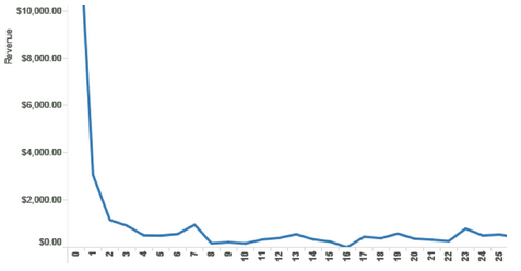
We've been fine-tuning this on our site for the past few months, and we've been able to greatly enhance our conversion attribution accuracy. In our video case study, I mentioned that we enhanced attribution by 47.5%; since that time, we've seen the accuracy of our data continue to climb; whereas before, we were seeing 'Direct / None' account for 45.5% of our conversions, it now accounts for just 20.6% - a decrease of 54.7%. Better yet, look at what it's done to all of our traffic:


We've gone from having about 20-25% of our traffic come in 'Direct / None' to just under 15%, and I anticipate that number will continue to fall.

DirectMonster and Universal Analytics
One of the coolest features that Universal Analytics has given us is Custom Dimensions. If you're not familiar with them, take a minute and read the Google Developer Resources page about what they are and how they work. Although initially designed for the asynchronous code, Universal Analytics has allowed us to put DirectMonster on steriods. 

In our Universal implementation, we store the visitors CID as a visit-level custom dimension, and we add their CID to the hashed parameters we're already storing in the anchor of their URL. 

When a visitor comes through on a link with a CID that differs from their own, we capture the stored CID as the Assisted Referrer. Then, we can open up our Custom Reports later on and view what visitors were referred to our site by whom, and what they did when they got there.

What does this mean? If a celebrity tweets a link to your product, you can discover exactly how many visitors they referred, and how much revenue those visitors generated. 

By cross-referencing the Assisted CID for single-visit 'Direct / None' purchases, you can discover the true visit history of a conversion.

Since it takes advantage of advanced Universal Analytics functionality, DirectMonster 2.0 requires some advanced implementation as well. Unlike its cousin, you'll need to adjust your Analytics tracking code to include a few functions, and you'll need to configure the Custom Dimensions you'll be storing a visitors CID and assisted referrers CID inside of. For a full reference on how to get either version of DirectMonster and configure it for your site, check out our blog post covering the topic in detail here or visit our GitHub page and get DirectMonster for yourself. 

I hope that you're as excited as I am about this development and all of the things Universal Analytics is enabling us to do. Think of a use case I didn't mention? Share it with me in the comments!

Posted by Dan Wilkerson, marketing manager at LunaMetrics

Monitoring & Analyzing Error Pages (404s) Using Analytics

I recently wrote a post on the Google Analytics + page about monitoring error pages on websites. The post was well received and generated a healthy discussion on Google+, so I decided to write a more detailed article on the subject here.

First of all, what exactly is an error or 404 page? According to WikipediaThe 404 or Not Found error message is a HTTP standard response code indicating that the client was able to communicate with the server, but the server could not find what was requested.” Or, in more general terms, the 404 is the error you get when the page you are looking for does not exist, usually because the link you clicked was broken.
Another important question is: why should I care? Often times the 404 is forgotten and no one cares to prioritize its optimization. I believe the answer to prioritization lies on section 2 of this post: by monitoring the percentage of users that arrive at this page you will be in a better position to know if (and how quickly) you should optimize your 404 page. In any case, even if the number of people viewing this page is low, you should at least have a page in the lines of your brand and try to add the elements described in section 1 below; after all, you don’t want to disappoint your customers!
In this post I propose a few techniques to help improve error pages, engage visitors and improve the website experience. The questions I will try to answer are the following:
  1. How to build your 404 page?
  2. How to monitor your 404 page traffic efficiently?
  3. How to analyze & optimize 404 page success?

1. Error Pages Best Practices

Before we dive into Google Analytics, let’s take a look into some ways to create a great 404 page from the beginning. Following are some good usability insights proposed in a book called Defensive Design for the Web. The authors advise us to offer customized "Page Not Found" error pages; and they provide an interesting insight into how to create error pages:
Instead of merely saying a page is not found, your site needs to explain why a page can't be located and offer suggestions for getting to the right screen. Your site should lend a hand, not kick people when they are down. Smart things to include on your 404 page:
  1. Your company's name and logo
  2. An explanation of why the visitor is seeing this page
  3. A list of common mistakes that may explain the problem
  4. Links back to the homepage and/or other pages that might be relevant
  5. A search engine that customers can use to find the right information
  6. An email link so that visitors can report problems, missing pages, and so on

2. Monitoring Error Page Traffic

Suppose a prominent blog links to your site and the link is broken, this will cause a negative experience to users (which will not find what they expected) and to search engines (which will not crawl the right content). How long will it take until you notice it? How often do you check the traffic to your 404 page? Chances are you don’t do it every day, but you should! Or at least you should have someone look at it: why not let Google Analytics do it for you? 
Create an Alert on Google Analytics
In the screenshot below you will see how to set an alert on Google Analytics that will let you know each time your 404 pageviews increases above a certain threshold. This will enable you to do the work once and be alerted every time there is a problem. 
The alert below is based on the increase in error pageviews, but if you decide to create a goal (as suggested below) you could create the alert based on the goal too. Note that you can opt in to receive an email or a text message when the condition is met (404 pageviews increases more than 15% compare to previous day). Also note that I decided to define the 404 page based on the title of the page, very often there is no indication of an 404 page on the URL (read more about this below). 
To learn how to set a Custom Alert check this help center article.

Measure your 404 Page as a Goal
Setting the 404 page as a goal on Google Analytics will surface important information that can be achieved only through goals, e.g. the last three steps before getting to this page. Below is a screenshot on how to do it, but note that you would need to have an identifier on your URL (or trigger an event) in order to set your 404 as a Goal.
Add Your 404 Content Report to Your Dashboard
Every report on Google Analytics can be added to the dashboard. By adding the 404 page to your dashboard you will be able to constantly monitor the trend of visits to your 404 page. Learn more about customizing dashboards.

3. Analyzing & Optimizing Error Pages

Monitoring your 404 pages is important, but useless if you don't take action using this information. Taking action means doing all you can to decrease the number of people getting missing pages. Below I provide a few tips on how to find and fix both internal and external broken links.
Check Your Navigation Summary Report
This will help you understanding where did visitors come from from inside your site, i.e. it will tell you which pages contain internal broken links. You will also be able to understand what is the percentage of visitors that arrive to the 404 page from internal and external sources; the internal sources will be listed on this report. See navigation summary screenshot below:

Check 404 Page URLs
Learning which URLs are producing the errors is a great way to get rid of them. If you learn, for example, that 100 visitors a day get an error when they visit the page “/aboutS” you can infer that there is a broken link leading to it; sometimes it might not be possible to find the source of the error to fix the link, but you can add a redirect from that page to “/about”, which looks to be the right page. 
In order to do that you will need to find the report below, but please keep in mind that some assumptions were made to arrive at it. Most CMS (Wordpress, Drupal, and others) will return an error for non-existing pages on the actual content section, but they will keep the original URL; however, they will have a page title with the word 404 in it. So check your site to know if that is the case before you try the report below.
Once you find this report, click on the first entry and you will get a list of all the URLs that triggered an error page. Good luck with the redirects!
Measure Internal Searches From this Page
If you do not have a search box on your 404 page, you should seriously consider adding one. Through searches performed in this page you will be able to understand what people were expecting to find there and you will get insights on which links you should add to the page. If you don’t have Internal Site Search enabled on Google Analytics check this help center article.
Below are the metrics you will be able to analyze if you use this feature:
  • Total Unique Searches: the number of times people started a search from the 404 page. Duplicate searches within a single visit are excluded.
  • Results Pageviews/Search: the average number of times visitors viewed a search results page after performing a search.
  • % Search Exits: the percentage of searches that resulted in an immediate exit from your site.
  • % Search Refinements: the percentage of searches that resulted in another search (i.e. a new search using a different term).
  • Time after Search: The average amount of time visitors spend on your site after performing a search.
  • Search Depth: The average number of pages visitors viewed after performing a search.
Closing Thoughts
As we mentioned above, errors happen, and we must be prepared for them. We must give a hand to our visitors when they are most frustrated and help them feel comfortable again. The level of online patience and understanding is decreasing and users have a world of choices just one click away, so website owners cannot let one small error get on their way.
Posted by Daniel Waisberg, Analytics Advocate

Full Credit Measurement: Attribution with Google Analytics

As we’ve discussed in many previous posts, the customer journey is evolving — most consumers will interact with many different marketing channels before a sale or conversion. And marketers are recognizing this shift in consumer behavior. Instead of “last click” measurement, a strategy that only gives credit to the final interaction, they’re turning to full credit measurement. To help you make sense of the full customer journey, we’ve been focused on bringing you the very best full credit measurement tools in Google Analytics.

Nearly two years ago, we announced our first Google Analytics attribution product, Multi-Channel Funnels. With its ability to measure customers’ different paths to conversion, it quickly became one of our most popular reports for advertisers and publishers alike. We’ve seen great results from our users, including online travel agency On the Beach, who used data from the Multi-Channel Funnels reports and AdWords Search Funnels to explore and adjust their strategy for generic keywords. These attribution adjustments helped On the Beach to drive a 25% uplift in ROI — see the full case study here.

Beyond Multi-Channel Funnels, we also wanted to provide our users with an advanced platform for testing entirely new, more robust attribution strategies, including the ability to test alternative models or understand how metrics, such as site engagement, could impact their existing investments. So last year we released our Attribution Modeling feature — the Model Comparison Tool.

After several months of testing on a public whitelist, we're now in the process of rolling out the Attribution Model Comparison Tool to make it generally available to Google Analytics users without whitelist.  To reflect the importance of attribution, we also created a new “Attribution” section under the “Conversions” reports, so the tool will be found there.

Be sure to check out a previously recorded webinar with Product Manager Bill Kee for a complete walkthrough of the Attribution Model Comparison Tool, or view our multi-part attribution webinar series covering our entire selection of full-credit measurement tools.

See the full Impact of Unclicked Display and Video Ad Impressions using Google Analytics

Every customer journey is different — a customer may see your display or video ads, receive an email, and then click through to your site from a search ad or organic search listing. Often, viewing display ads can attract your clients’ interest in your product and brand even if no click occurs. Traditionally, measurement technology separated out impressions or “view throughs” from clicks, but this separation missed out on valuable data on the impact of display advertising.

Thanks to our integration with the Google Display Network (GDN), Google Analytics can now break down the separation between clicks and impressions and give a more complete view of the customer journey. When a user views display ads on the GDN, or video ads on YouTube, and later visits your website and converts, these interactions with your brand can now be captured in Google Analytics Multi-Channel Funnels reporting.

GDN Impression Reporting is now available through limited whitelist. You can sign-up through this form to participate. Please note that we cannot guarantee access, but we will do our best to provide this feature to as many users as possible. Please also note that this data will only surface in the Multi-channel Funnels reports in Google Analytics. For more information on how to enable the feature in GA please see our help center article.

Read on below for more tips on how to make the most of this new feature.

How does Display fit on the conversion path?
By enabling GDN Impression Reporting in Google Analytics, you can learn how your display impressions assist your conversions.


In the Multi-Channel Funnels Overview Report you will see two additional conversion metrics. Impression Assisted Conversions shows how many of your conversion paths were touched by a display impression. Rich Media Assisted Conversions shows how many of your conversions had a rich media interaction on the path to conversion. Rich media interactions are user interaction with YouTube or rich media ad formats, such as ad expansion, video control (such as play, pause, and resume), or switching a video ad to full screen.

With the new Interaction Type selector you can now immediately filter your reports based how your users interacted with your marketing.

  • Select Impression to see conversion paths from customers who saw your GDN display ads but did not click on them.
  • Add Direct to the mix, to see who saw an ad and then visited your site directly to convert on a relevant transaction or Goal.
  • If you want to focus on Rich Media interactions, you can select this interaction type to see how your users convert after interacting with your rich media and YouTube ads.

How do I quantify the impact of display on the conversion path?
In the Multi-Channel Funnels Top Conversion Path report you can see two new path elements, which indicate the presence of a display interaction. The “eye” symbol indicates a pure display impression from a non-interactive display image. This means a user has been exposed to your display ad on the journey to conversion, without clicking on it. The “movie” symbol indicates a user has interacted with one of your Rich Media ads, such as a YouTube video ad.

Now you can see how many conversion paths, and how much associated value, has been driven through paths which benefited from a display impression or rich media interactions. To better quantify your brand targeted display efforts, consider breaking out these campaigns using custom channel grouping.


Assigning partial credit to valuable display interaction touchpoints
You can use the custom model builder from the Attribution Modeling tool to assign partial credit to these display events. Consider giving these events on the user’s conversion path more credit, and compare this against your baseline model.

We also added a new set of dimensions to help you define valuable custom segments for your analysis. Want to see how many users are watching your TrueView video ads fully? Just create a custom segment using one of our new dimensions, TrueView. The full list of new dimensions is:
  • Above the Fold: This dimension uses the Google Above the Fold measurement solution. The value is “Yes” if the ad was in the visible area of the screen when the page was loaded.
  • Video Played Percent: The value can be “>=25%”, “>=50%”, “>=75%”, and “100%”, allowing you to see how much of a video ad was watched.
  • TrueView: If a user has watched more than 30 seconds of an ad, or watched the ad completely, this will have a value of “Yes.” This is a payable event.
Enabling GDN Impression Reporting in Google Analytics
Once we have whitelisted your account, please ensure you have successfully linked your AdWords account to your Google Analytics account. Linking accounts takes just a few moments. Under ‘Data Sources’ > ‘AdWords’ you can then see an entry for each linked AdWords account. In the row there is a toggle switch named ‘GDN Impression Reports’, which turns the display impression data from the Google Display Network On and Off. Data is recorded from the time the switch is turned On.


We hope these new tools will help you understand the full impact of your display campaigns through Multi-Channel Funnels and Attribution. Sign up today for GDN Impression Reporting in Google Analytics.

Introducing “The Customer Journey to Online Purchase" — interactive insights on multi-channel marketing

Savvy marketers understand that you don’t always seal the deal with a single message, image, or advertisement. A user may see a display ad, click on a link from a friend, or do a search before buying something from your website — and all of these interactions can play a role in the final sale. It’s important to understand the entire customer journey so you can measure all of the elements that contribute to your campaigns, attribute the right value to them, and adjust your marketing budgets where appropriate.

That’s the philosophy behind Google Analytics tools like Multi-Channel Funnels and Attribution Modeling. Tens of thousands of our largest advertisers are gaining valuable insights from Multi-Channel Funnels every month, and we’ve collected these insights using aggregate statistics to develop a benchmarking tool — The Customer Journey to Online Purchase. This interactive tool lets you explore typical online buying behavior and see how different marketing interactions affect business success.


The tool draws on Ecommerce and Multi-Channel Funnels data from over 36,000 Google Analytics clients that authorized sharing, including millions of purchases across 11 industries in 7 countries. Purchase paths in this tool are each based on interactions with a single ecommerce advertiser.

You’ll find benchmark data for:
  • how different marketing channels (such as display, search, email, and your own website) help move users towards purchases. For example, some marketing channels play an “assist” role during the earlier stages of the marketing funnel, whereas some play a “last interaction” role just before a sale.
  • how long it takes for customers to make a purchase online (from the first time they interact with your marketing to the moment they actually buy something), and how the length of this journey affects average order values.

Channel Roles in the Customer Journey
The data shows that every industry is different — the path to purchase for hotel rooms in Japan is not necessarily the same as the path as for an online supermarket in Canada.

A few findings stand out, in particular:
  • As you might expect, customers typically click on display ads early in their purchase journeys, but in some industries, such as US travel and auto, display clicks tend to occur closer to the purchase decision.
  • Across industries and countries, paid search has a fairly even assist-to-last interaction ratio, implying that this channel can act both in the earlier and later stages of the customer journey.

Advanced tip:
  • Once you’ve explored the benchmarks, look deeper into your own marketing data with the Multi-Channel Funnel reports, and consider defining your channels and campaigns to separate out categories that are specific to your business needs.

Purchase values and the length of the journey
We also see interesting patterns emerge when examining the length of the customer journey. While the majority of purchases take place within a single day or a single step (i.e., a single interaction with one marketing channel), longer paths tend to correlate with higher average order values. 

For example,
  • in US Tech, online purchases that take more than 28 days are worth about 3.5 times more than purchases that occur immediately. And while 61% of tech purchases take place on that first day, only 53% of revenue comes from single-day purchases.
  • in Consumer Packaged Goods (CPG), on the other hand, most purchases (82%) are quick, likely because these are smaller and simpler purchases that don’t require much research.
  • in Edu / Gov, 41% of revenue comes from multi-day purchases, but 60% of revenue comes from multi-step purchases — suggesting that even when customers make decisions in a relatively short time period, they often have multiple marketing interactions before purchasing.

Advanced tip:
  • In Multi-Channel Funnels or the Attribution Modeling Tool, you can adjust the lookback window to reflect the typical length of the purchase path in your industry. For example, if your business tends to have shorter paths, you can zoom in on paths that take 5 days or less:

Putting the benchmarks to work
For marketers, it’s always a crucial challenge to design campaigns that deliver the right message at the right moment in a customer’s journey to purchase. We hope these benchmarks will provide useful insights about the journey and help you put your business into context. In particular, take a look at the final infographic, the “Benchmarks Dashboard,” to get a quick overview of your industry. Then, when you view your own data in the Multi-Channel Funnels reports in Google Analytics, you’ll gain a better understanding of where different channels impact your conversions and what your typical path looks like, so you can adjust your budgeting and marketing programs accordingly.

Try The Customer Journey to Online Purchase today on Google’s new Think Insights website.

Happy analyzing!

Universal Analytics Business Applications

The following is a guest post by the Analytics Team at Loves Data, a Google Analytics Certified Partner.

Universal Analytics introduces a new set of Google Analytics features allowing businesses to gain a deeper and more strategic understanding of what’s capturing the attention of customers as they move from online to offline. So how can Universal Analytics help businesses turn customer data into sales? We at Loves Data designed a simple experiment to find out.
Who drinks coffee? Who drinks tea? How much? How often? When? The answer to these questions reveal the role our espresso coffee machine and tea kettle play in productivity - and any need to order more tea or coffee! Take a look at our video to see what we learned.
Our experiment at Loves Data also measured how often and how much time team members spent standing in front of a display screen in the office viewing our website analytics.

Montage: Loves Data’s Universal Analytics office experiment will benefit businesses:

Experiment creates a new path to customers
Our team designed an experiment to dive into Universal Analytics by creating interactive scenarios inside our office. We integrated sensors and RFID readers to capture data about coffee and tea making behaviour in our office. We also measured each time the fridge was opened, when one of our team updated a support ticket, client hours were logged, code was committed, administrative tasks, and viewing of our Google Analytics dashboard display.
New Business Opportunities
Measuring users across platforms opens up new business opportunities. The RFID keys we’ve used in our experiments can be used to measure loyalty card usage. We can use Universal Analytics to enable retailers with bricks and mortar stores to measure customer behaviour and to improve and integrate online and offline sales and marketing.
Here are a few Universal Analytics opportunities we have identified at Loves Data for our clients:
  • Integrated measurement and analysis of in-store POS systems along with desktop and mobile e-commerce platforms
  • Measuring offline macro and micro conversions through physical buttons or integration with CRMs
  • Measuring physical interaction for example at display booths at conventions or artworks at major exhibitions through to online engagement on associated websites
Our office experiment provided ourselves and our clients with a range of valuable insights and showed that with Universal Analytics we can measure just about anything!
Posted by the Analytics Team at Loves Data, a Google Analytics Certified Partner. Learn more about Loves Data on their website, Google+ or check out their digital analytics and online marketing blog.

Get Useful Insights Easier: Automate Cohort Analysis with Analytics & Tableau

The following is a guest post by Shiraz Asif, Analytics Solutions Architect at E-Nor, a Google Analytics Certified Partner.

Cohort analysis provides marketers with visibility into the behavior of a “class” of visitors, typically segmented by an action on a specific date range. There are many applications and businesses that would benefit tremendously from cohort analysis, including the following sample use cases:
  • What traffic channel yields the most valuable customers (not just valuable one time conversions)
  • Customer life time volume based on their first bought item (or category)
  • Methods for gaining and retaining customers and which groups of customers to focus on
  • For content and media sites, understanding frequency, repeat visitors and content consumption after sign up or other key events
  • Repeat Purchase Probability 
If you read E-Nor President and Principal consultant Feras Alhlou’s latest post on cohort analysis in a cross-platform environment, and read until the very end, you saw a note about a follow up post on how to automate cohort reporting from Google Analytics in Tableau. This is what I'll outline in today’s post. Why the emphasis on automation, you might ask? Without automation, we end up spending more time than necessary on exporting/copying/pasting/massaging data which can eat up resources better used analyzing and optimizing. 

In addition to report automation, data visualization is also key. Google Analytics offers amazing visualization, including the recently announced dashboard enhancements, but at times you also want to view the data and trend it or merge with other sources. For this, its best to use tools available in the Google Analytics Application Gallery or a BI platform like Tableau.

With the introduction out of the way, following is a step-by-step guide to automated, cohort analysis with Google Analytics and Tableau:

1. Cohort Data Elements in Google Analytics

If you have your cohort data elements already captured in Google Analytics, then skip this step, otherwise, this post is on setting up cohort data in by Google’s Analytics Advocate Justin Cutroni is a must.

2. Tableau version 8 (Google Analytics connectors)

In order to automate reports, you need to have Tableau version 8, since this is the version that has a Google Analytics connector (works well, although still in beta).

3. Data Import from Google Analytics Into Tableau
  • From the Tableau home screen, select Connect to Data, and then pick the Google Analytics connector. After authenticating to Google Analytics, you'll be prompted to select your Account, Property and Profile, if you have access to more than one.
  • Set up the data import to get your Custom Variable key (e.g. CV1) and Date as dimensions, and Revenue as a Metric.

4. Tableau Cohort Analysis Configuration
  • Change the format from Google's 20130113 to a Tableau DATE format. Since the date was stored in a custom variable, it was stored as a string. So that Tableau can treat this as a date, we need to convert the string to a date format. This was done by creating a new Calculated field in Tableau. We called the field "Cohort Date". The formula below worked for our purposes but would require some tweaking for larger datasets.
  • Now that we have the date in the format we want, the next step is to subtract the cohort date from the transaction date.  To do this, we created another calculated field called "Days since Signup". The formula for this field was simply:
DATEDIFF('day',[Cohort Date],[Date]). 

Important:  Tableau natively treated this as a "Measure" since it is a number. However since we're going to be graphing this on the X Axis, you should drag it to the Dimensions pane.
  • Drag the Revenue measure to the rows Rows tab. Now drag the Days since Signup to the Columns tab. You should see a long graph similar to:
  • Drag the Cohort date to the Filter pane, and select the cohort dates you'd like to visualize. For ease of use, I suggest, select only a few to begin with. Drag the Cohort to the color shelf to enable color coding of individual cohort dates.
  • Now let's make a couple of adjustments to make the visualization more useful. In the color shelf, click the down arrow next to Cohort Date, and change the default display from Continuous to Discrete. Then, in the same field, select Exact Date instead of Year.
Voila! Your final view should look like this: 

There you have it. With a few steps, we’ve pulled data from Google Analytics via the API using Tableau, massaged the data and then created a very insightful visualization. With this work now done, the graphic can be easily updated/refreshed. This takes the manual and mundane work of setting up the graphic and automates it so we can spend more time analyzing the data and finding hidden insights for our clients.  

Posted by Shiraz Asif, Analytics Solutions Architect at  E-Nor, Google Analytics Certified Partner. Learn more about E-Nor on their website, Google+ or check out their Marketing Optimization blog.

Google Tag Manager: Implementation webinar video, cheat-sheet, and Q&A


Last Tuesday, we held a webinar on the technical implementation of Google Tag Manager, a free tool that makes it easy for marketers to add and update website tags, freeing up webmaster time while providing users with more reliable data and insights. This technical session includes a more in-depth look than our introductory webinar, illustrating how the product operates in a live environment and showing how flexible Google Tag Manager is for enterprise systems.

Watch the webinar video here for:
  • Step-by-step implementation process + live product demo
  • Advanced use cases, including the Data Layer API
  • Best practices and common pitfalls


And don’t forget to download our handy implementation Cheat-Sheet, which outlines each of the steps involved in migrating onto Google Tag Manager.

Click here to download the Implementation Cheat-Sheet: http://goo.gl/5GJyA

And as usual, we like to provide a recap of some of the top questions we received during the webinar. Please note that this webinar is intended for technical audiences, so some of the Q&A below gets into the nitty-gritty technical details. If you’re less experienced technically, we invite you to check out our forum or reach out to one of our certified partners for implementation assistance.

Questions and Answers

Where can I find more detailed information about all of this stuff?
In addition to the walkthrough we provide in the webinar and our Cheat-Sheet, you can find a detailed description of the implementation process in the Google Developer docs, and helpful articles about how to use the Google Tag Manager user interface in our Help Center, including some notes about what to think about before you begin implementing. And as noted above, if you still have questions, check out our forum or reach out to one of our certified partners for implementation assistance.

Where can I place the GTM snippet? Can I put it in <head>? Does placing it in the footer have any adverse effects? Can I place the data layer in <head>?
The recommended location for the GTM snippet is just after the opening <body> tag. The only exception to this would be in the case where you want to declare page-level metadata by declaring the data layer immediately above the GTM snippet.

The GTM snippet can be deployed later in the page, like the footer, but doing so increases the time before the snippet loads. This can cause incremental amounts of data loss, since the user could navigate away before all your tags finish loading.

We do not recommend placing the GTM snippet in head, because the GTM snippet contains an <iframe> for the <noscript> case. Iframes are not officially supported by any browsers in <head> and might cause unexpected behavior.

What should I do about collecting macros and tagging events if I don’t have access to my client’s site or if IT is too busy?
If you can’t access values on the page via the data layer, there are several different Macro types to help you capture data without needing a code change. These include DOM element, DOM attribute, and JS variable macros. Simply input the ID or variable names, and the macro will pull out the data for you. NOTE: If you go this route, you may want to accompany the tag being fired with an “{{event}} equals gtm.dom” rule. This makes sure the element has loaded in the page before you request it, so you don’t get an undefined macro value.

If you're trying to add events to the page, currently this requires code changes. We're working on a solution that doesn't need code changes, but in the meantime we've heard of a couple of folks using the Custom HTML template to inject the dataLayer.push() API into relevant parts of the page. We can’t guarantee this as a solution due to the asynchronous nature of tag loading in Google Tag Manager, but we have heard some success stories.

How do I do cross-domain tracking in Google Analytics using Google Tag Manager?
It's now possible to do cross-domain tracking in GA using the custom HTML template and a new track type within the Google Analytics tag template. We've got some exciting things in the works here to make cross-domain tracking even easier; stay tuned for more soon.

Do you have any account and container setup best practices? What if I’m an agency? What if I have separate sites for mobile and desktop?
In general, an account should be owned by a single advertiser or publisher. Within each account, there can be multiple containers, and containers should be split according to how the site or sites are managed. For instance, if there’s a separate marketing team managing different countries and therefore probably different tag vendors, then there should be a separate container per country. If you have a mobile site and a desktop site that use the same tags across both subdomains, then you should probably only use a single container. We have found that one container per domain is pretty standard, but there are always different situations that call for a different setup.

If you’re an agency, we strongly recommend that your client creates the initial Google Tag Manager account and container, and then have your client add you to the container. Google Tag Manager includes user permissions controls as well as multi-account access to make it easier for agencies and clients to work together.

Are all tags with document.write off limits? Are there any workarounds?
Most tags that utilize document.write are just trying to construct an image pixel with dynamic parameters using JavaScript. Luckily, our Custom Image Tag allows you to construct an image pixel with dynamic parameters. Look at the tag you’re trying to add, pick out the URL, paste it into the Image URL field, and then add any dynamic variables by using the {{macro}} syntax. See the live demo in the webinar video above for an example of how to do this.

Do not add tags that contain document.write in either the initial snippet or in any linked JavaScript. Doing so will cause undesirable effects.

How do Google Analytics events differ from Google Tag Manager events?
Events in Google Tag Manager are basically an indication that this is an event where other tags could fire. It does not collect any data. GTM events are used in tag firing rules to initiate the placement of other tags.

Google Analytics events are actually data events, and can be set up in Google Tag Manager via the Google Analytics template, tracking type “Event”. This tag sends data to Google Analytics to be reported on within the Google Analytics interface.

~~

We hope the webinar and Q&A will help you implement Google Tag Manager smoothly and easily -- many business, including GoPro, are already enjoying easier tagging. Keep watching this blog for more tips and tricks!

Multi-armed Bandit Experiments

This article describes the statistical engine behind Google Analytics Content Experiments. Google Analytics uses a multi-armed bandit approach to managing online experiments. A multi-armed bandit is a type of experiment where:
  • The goal is to find the best or most profitable action
  • The randomization distribution can be updated as the experiment progresses
The name "multi-armed bandit" describes a hypothetical experiment where you face several slot machines ("one-armed bandits") with potentially different expected payouts. You want to find the slot machine with the best payout rate, but you also want to maximize your winnings. The fundamental tension is between "exploiting" arms that have performed well in the past and "exploring" new or seemingly inferior arms in case they might perform even better. There are highly developed mathematical models for managing the bandit problem, which we use in Google Analytics content experiments.

This document starts with some general background on the use of multi-armed bandits in Analytics. Then it presents two examples of simulated experiments run using our multi-armed bandit algorithm. It then address some frequently asked questions, and concludes with an appendix describing technical computational and theoretical details.

Background

How bandits work

Twice per day, we take a fresh look at your experiment to see how each of the variations has performed, and we adjust the fraction of traffic that each variation will receive going forward. A variation that appears to be doing well gets more traffic, and a variation that is clearly underperforming gets less. The adjustments we make are based on a statistical formula (see the appendix if you want details) that considers sample size and performance metrics together, so we can be confident that we’re adjusting for real performance differences and not just random chance. As the experiment progresses, we learn more and more about the relative payoffs, and so do a better job in choosing good variations.

Benefits

Experiments based on multi-armed bandits are typically much more efficient than "classical" A-B experiments based on statistical-hypothesis testing. They’re just as statistically valid, and in many circumstances they can produce answers far more quickly. They’re more efficient because they move traffic towards winning variations gradually, instead of forcing you to wait for a "final answer" at the end of an experiment. They’re faster because samples that would have gone to obviously inferior variations can be assigned to potential winners. The extra data collected on the high-performing variations can help separate the "good" arms from the "best" ones more quickly.
Basically, bandits make experiments more efficient, so you can try more of them. You can also allocate a larger fraction of your traffic to your experiments, because traffic will be automatically steered to better performing pages.

Examples

A simple A/B test

Suppose you’ve got a conversion rate of 4% on your site. You experiment with a new version of the site that actually generates conversions 5% of the time. You don’t know the true conversion rates of course, which is why you’re experimenting, but let’s suppose you’d like your experiment to be able to detect a 5% conversion rate as statistically significant with 95% probability. A standard power calculation1 tells you that you need 22,330 observations (11,165 in each arm) to have a 95% chance of detecting a .04 to .05 shift in conversion rates. Suppose you get 100 visits per day to the experiment, so the experiment will take 223 days to complete. In a standard experiment you wait 223 days, run the hypothesis test, and get your answer.

Now let’s manage the 100 visits each day through the multi-armed bandit. On the first day about 50 visits are assigned to each arm, and we look at the results. We use Bayes' theorem to compute the probability that the variation is better than the original2. One minus this number is the probability that the original is better. Let’s suppose the original got really lucky on the first day, and it appears to have a 70% chance of being superior. Then we assign it 70% of the traffic on the second day, and the variation gets 30%. At the end of the second day we accumulate all the traffic we’ve seen so far (over both days), and recompute the probability that each arm is best. That gives us the serving weights for day 3. We repeat this process until a set of stopping rules has been satisfied (we’ll say more about stopping rules below).

Figure 1 shows a simulation of what can happen with this setup. In it, you can see the serving weights for the original (the black line) and the variation (the red dotted line), essentially alternating back and forth until the variation eventually crosses the line of 95% confidence. (The two percentages must add to 100%, so when one goes up the other goes down). The experiment finished in 66 days, so it saved you 157 days of testing.


Figure 1. A simulation of the optimal arm probabilities for a simple two-armed experiment. These weights give the fraction of the traffic allocated to each arm on each day.

Of course this is just one example. We re-ran the simulation 500 times to see how well the bandit fares in repeated sampling. The distribution of results is shown in Figure 2. On average the test ended 175 days sooner than the classical test based on the power calculation. The average savings was 97.5 conversions.


Figure 2. The distributions of the amount of time saved and the number of conversions saved vs. a classical experiment planned by a power calculation. Assumes an original with 4% CvR and a variation with 5% CvR.

But what about statistical validity? If we’re using less data, doesn’t that mean we’re increasing the error rate? Not really. Out of the 500 experiments shown above, the bandit found the correct arm in 482 of them. That’s 96.4%, which is about the same error rate as the classical test. There were a few experiments where the bandit actually took longer than the power analysis suggested, but only in about 1% of the cases (5 out of 500).

We also ran the opposite experiment, where the original had a 5% success rate and the the variation had 4%. The results were essentially symmetric. Again the bandit found the correct arm 482 times out of 500. The average time saved relative to the classical experiment was 171.8 days, and the average number of conversions saved was 98.7.

Stopping the experiment

By default, we force the bandit to run for at least two weeks. After that, we keep track of two metrics.
The first is the probability that each variation beats the original. If we’re 95% sure that a variation beats the original then Google Analytics declares that a winner has been found. Both the two-week minimum duration and the 95% confidence level can be adjusted by the user.

The second metric that we monitor is is the "potential value remaining in the experiment", which is particularly useful when there are multiple arms. At any point in the experiment there is a "champion" arm believed to be the best. If the experiment ended "now", the champion is the arm you would choose. The "value remaining" in an experiment is the amount of increased conversion rate you could get by switching away from the champion. The whole point of experimenting is to search for this value. If you’re 100% sure that the champion is the best arm, then there is no value remaining in the experiment, and thus no point in experimenting. But if you’re only 70% sure that an arm is optimal, then there is a 30% chance that another arm is better, and we can use Bayes’ rule to work out the distribution of how much better it is. (See the appendix for computational details).

Google Analytics ends the experiment when there’s at least a 95% probability that the value remaining in the experiment is less than 1% of the champion’s conversion rate. That’s a 1% improvement, not a one percentage point improvement. So if the best arm has a conversion rate of 4%, then we end the experiment if the value remaining in the experiment is less than .04 percentage points of CvR.

Ending an experiment based on the potential value remaining is nice because it handles ties well. For example, in an experiment with many arms, it can happen that two or more arms perform about the same, so it does not matter which is chosen. You wouldn’t want to run the experiment until you found the optimal arm (because there are two optimal arms). You just want to run the experiment until you’re sure that switching arms won’t help you very much.

More complex experiments

The multi-armed bandit’s edge over classical experiments increases as the experiments get more complicated. You probably have more than one idea for how to improve your web page, so you probably have more than one variation that you’d like to test. Let’s assume you have 5 variations plus the original. You’re going to do a calculation where you compare the original to the largest variation, so we need to do some sort of adjustment to account for multiple comparisons. The Bonferroni correction is an easy (if somewhat conservative) adjustment, which can be implemented by dividing the significance level of the hypothesis test by the number of arms. Thus we do the standard power calculation with a significance level of .05 / (6 - 1), and find that we need 15,307 observations in each arm of the experiment. With 6 arms that’s a total of 91,842 observations. At 100 visits per day the experiment would have to run for 919 days (over two and a half years). In real life it usually wouldn’t make sense to run an experiment for that long, but we can still do the thought experiment as a simulation.

Now let’s run the 6-arm experiment through the bandit simulator. Again, we will assume an original arm with a 4% conversion rate, and an optimal arm with a 5% conversion rate. The other 4 arms include one suboptimal arm that beats the original with conversion rate of 4.5%, and three inferior arms with rates of 3%, 2%, and 3.5%. Figure 3 shows the distribution of results. The average experiment duration is 88 days (vs. 919 days for the classical experiment), and the average number of saved conversions is 1,173. There is a long tail to the distribution of experiment durations (they don’t always end quickly), but even in the worst cases, running the experiment as a bandit saved over 800 conversions relative to the classical experiment.


Figure 3. Savings from a six-armed experiment, relative to a Bonferroni adjusted power calculation for a classical experiment. The left panel shows the number of days required to end the experiment, with the vertical line showing the time required by the classical power calculation. The right panel shows the number of conversions that were saved by the bandit.

The cost savings are partially attributable to ending the experiment more quickly, and partly attributable to the experiment being less wasteful while it is running. Figure 4 shows the history of the serving weights for all the arms in the first of our 500 simulation runs. There is some early confusion as the bandit sorts out which arms perform well and which do not, but the very poorly performing arms are heavily downweighted very quickly. In this case, the original arm has a "lucky run" to begin the experiment, so it survives longer than some other competing arms. But after about 50 days, things have settled down into a two-horse race between the original and the ultimate winner. Once the other arms are effectively eliminated, the original and the ultimate winner split the 100 observations per day between them. Notice how the bandit is allocating observations efficiently from an economic standpoint (they’re flowing to the arms most likely to give a good return), as well as from a statistical standpoint (they’re flowing to the arms that we most want to learn about).


Figure 4. History of the serving weights for one of the 6-armed experiments.

Figure 5 shows the daily cost of running the multi-armed bandit relative to an "oracle" strategy of always playing arm 2, the optimal arm. (Of course this is unfair because in real life we don’t know which arm is optimal, but it is a useful baseline.) On average, each observation allocated to the original costs us .01 of a conversion, because the conversion rate for the original is .01 less than arm 2. Likewise, each observation allocated to arm 5 (for example) costs us .03 conversions because its conversion rate is .03 less than arm 2. If we multiply the number of observations assigned to each arm by the arm’s cost, and then sum across arms, we get the cost of running the experiment for that day. In the classical experiment, each arm is allocated 100 / 6 visits per day (on average, depending on how partial observations are allocated). It works out that the classical experiment costs us 1.333 conversions each day it is run. The red line in Figure 5 shows the cost to run the bandit each day. As time moves on, the experiment becomes less wasteful and less wasteful as inferior arms are given less weight.


Figure 5. Cost per day of running the bandit experiment. The constant cost per day of running the classical experiment is shown by the horizontal dashed line.

1The R function power.prop.test performed all the power calculations in this article.
2See the appendix if you really want the details of the calculation. You can skip them if you don’t.

Posted by Steven L. Scott, PhD, Sr. Economic Analyst, Google

Google Tag Manager: Technical Implementation Deep Dive Webinar

Just three months ago we launched Google Tag Manager to make it easier for marketers (or anyone in the organization) to add and update website tags, such as conversion tracking, site analytics, remarketing, and more. The tool provides an easy-to-use interface with templates for tags from Google and templates for other vendor’s tags, as well as customizable options for all your tagging needs. This minimizes site-coding requirements and simplifies the often error-prone tagging process.

In November, we held an introductory webinar (watch the recording here, plus read Q&A), and next week we’re holding a second webinar going beyond the basics and diving into the technical details and best practices for how to implement Google Tag Manager. This webinar will be hosted by Rob Murray, our Engineering Manager, and Dean Glasenberg, Sales Lead.

Webinar: Google Tag Manager Technical Implementation
Date: Tuesday, January 29, 2013
Time: 10 am PST / 1pm EST / 6pm GMT
Register here: http://goo.gl/17OFd
Recommended Audience: IT or webmaster team members

During the webinar we’ll go through a step-by-step process for implementation, and we’ll cover some more advanced topics (i.e. deploying more complex tags). We’ll introduce the role of a Data Layer and use it in conjunction with Events to show how you can set up a site to gather detailed usage metrics, for example, to help you understand why users are dropping off at a specific page.  We’ll also show you how common browser Developer Tools, as well as the Google Tag Manager Debug mode, can be used to help verify that your tags are working correctly (and fix them if they’re not).

Hope to see to see you on Tuesday!