Analyze Organic Search Engine Marketing with Google Analytics & Webmaster Tools Data

There are many ways to measure the effectiveness of organic search engine marketing. We’d like to explore various techniques in a series of posts here on the Analytics blog. Today we’ll talk about understanding organic using landing pages and Webmaster Tools data. 

Today, almost all marketers are investing heavily in creating high-quality content as a way to reach users with information about their products and services. The content can take many forms - from product specific content to brand specific content. The intent is to generate traffic and conversions from a variety of sources, one of the largest of which is often search.

One way to measure the effectiveness of content is to analyze its performance as a landing page. A landing page is the first page a user sees when they land on your site. If it’s great content, and if it’s ranked highly by search engines like Google, then you should see a lot of websites ‘entrances’ via that page. Looking at landing page performance, and the traffic that flows through specific landing pages, is a great way to analyze your search engine optimization efforts.

Begin by downloading this custom report (this link will take you to your Analytics account). This report shows the landing pages that receive traffic from Google organic search and how well the traffic performs. 

Let’s start at the top. The over-time graph shows the trend of Google organic traffic for your active date range. If you are creating great content that is linked to and shared then you should see the trend increasing over time.

When you look at this data ask yourself the question: how well does the trend align with my time investment? Looking at the data below we see that the organic traffic is increasing, so this organization must be working hard to create and share good content.

Organic traffic is steadily increasing for this site. An important question to ask is, “how does this align with my search optimization efforts?”
The table, under the trend data, contains detailed data about the acquisition of users, their behavior on the site and ultimately the conversions that they generate. This includes data like Visits, % New Visits, Bounce Rate, Average Time on Site, Goal Conversion Rate, Revenue and Per Visit Value. 

Using the tabular data I can learn how search engine traffic, entering through a specific page is performing. 

Each metric provides insight about users coming from organic search and entering through certain pages. For example, % New Visits can help you understand if you’re attracting a new audience or a lot of repeat users. Bounce rate can help you understand if your content is ‘sticky’ and interesting to users. And conversion rate helps you understand if organic traffic, flowing through these landing pages, is actually converting and driving value to your business.

Again, we’re using the landing page to understand the performance of our content in search engine results.

Remember, make sure that you customize the report to include goals that are specific to your account. You can learn more about goals and conversions in our help center.  

Another very useful organic analysis technique is to group your content together by ‘theme’ and analyze the performance. For example, if you are an ecommerce company you may want to group all of your pages for a certain product category together - like cameras, laptop computers or mobile phones.

You can use the Unified Segmentation tool to bundle content together. For example, here’s a simple segment that includes two branded pages (I’m categorizing the homepage and the blog page homepage as ‘brand’ pages).


You can create other segments that include other types of pages, like specific category pages (and then view both segments together). Here is the Acquisition > Keywords > Organic report with both segments applied. This helps me get a bit more insight into the types of pages people land on when visiting from Google organic search results.

Plotting two segments, one for branded content landing pages and one for non-branded landing pages, can help you understand your specific tactics.
Regardless of the tool you use, the analysis technique is the same: look at the performance of each landing page to identify if they are generating value for your business. And don’t forget, the best context for this data is your search engine marketing plan. 

Here’s one final tip when analyzing organic traffic. Whenever you create a customization in Google Analytics, like a segment or custom report, don’t use the keyword dimension. Instead use the Source and Medium dimensions. Set the Source to ‘Google’ and Medium of ‘Organic’. It provides the most consistent data over long time periods. 

In addition to using Google Analytics, you can also use the data from Webmaster Tools to gain an understanding of your search marketing tactics. You can link your Google Analytics account and your Webmaster Tools account to access some of this data directly in Google Analytics. If you’re not familiar with Webmaster Tools, check out their help center for an overview or this awesome video.


In general the Webmaster Tools data will help you understand how well your content is crawled, indexed and ranked by Google. This is extremely tactical data that can inform many search marketing decisions, like which content to create, how to structure your content and how to design your pages. The reports are in the Acquisition > Search Engine Optimization section. 

Let’s start by viewing some data using the Acquisition > Search Engine Optimization > Landing Pages report.

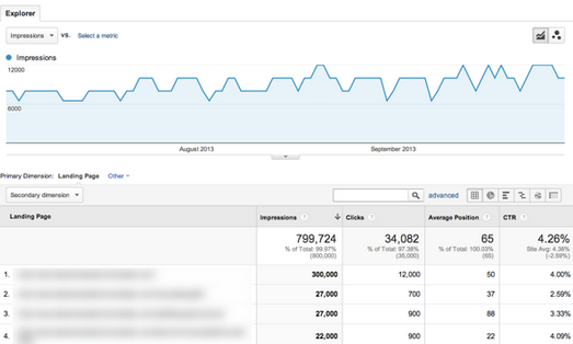
Webmaster Tools data is available directly in Google Analytics. You can view the data based on landing page or search query.
Let’s review a couple of metrics that are unique to Webmaster tools: Impressions, Average Position and Click Through Rate. Impressions is the number of times pages from your site appeared in search results. If you’re continuously optimizing the content on your site you should see your content move up in the search results and thus get more impressions.

Average position is the average top position for a given page. To calculate average position, Webmaster Tools take into account the top ranking URL from your site for a particular query. For example, if Alden’s query returns your site as the #1 and #2 result, and Gary’s query returns your site in positions #2 and #7, your average top position would be 1.5 [ (1 + 2) / 2 ].

Click Through Rate (CTR) is the percentage of impressions that resulted in a click and visit to your site. Again, you can see both the impressions and the CTR for every landing page on your site. 

If we’re optimizing content then hopefully we should see our average position increase, the impressions increase and ultimately an increase in click-throughs. A very easy way to observe this behavior is by applying a date comparison to the Acquisition > Search Engine Optimization > Landing Pages report.

Use the Search Engine Optimization > Landing Pages report to understand if your content is getting ranked higher and generating clicks.
What happens if impressions and average position are increasing but you’re not getting clicks? You’re getting ranked better, but what is listed in the results may not get a response from the user. 

There are lots of ways to optimize your content and change what is listed in the search results. You could adjust your page title or meta description to improve the data that is shown to the user and thus increase the relevancy of the result and your Click Through Rate. 

We’ll be back soon with another article on measuring and optimizing organic search traffic with Analytics.

Posted by Justin Cutroni, on behalf of the Google Analytics Education team

New Features In Google Analytics Content Experiments Platform

Analyzing data to gain insights into your business and marketing efficacy is just step one. Taking action on that data is the all too important next step. The Google Analytics team continues its focus on making analytics actionable with the latest additions to the Content Experiments Platform. Together, these new features make Google Analytics A/B testing engine more powerful than ever!


Google Analytics users who have linked their accounts to AdSense can now select AdSense Revenue as an experiment objective. Once set, Google Analytics Multi Armed Bandit optimization algorithms will shift traffic among the experimental variations to achieve maximum revenue in the shortest amount of time. This feature has been a top request among AdSense publishers and Google Analytics is excited to provide a tool to further empower our publisher ecosystem.  

For our most sophisticated Content Experiments users, we’ve added an advanced option to allow even traffic distribution across all experiment variations. Using this feature bypasses the programmatic optimization that Google Analytics provides so it isn’t right for everyone. If you have an experiment objective that can’t be entirely captured by a Content Experiment objective, then this new feature might be right for you.

Learn more about the Content Experiments Platform and the Content Experiments API.

Posted by Russell Ketchum, Google Analytics Product Manager

Multi-armed Bandit Experiments

This article describes the statistical engine behind Google Analytics Content Experiments. Google Analytics uses a multi-armed bandit approach to managing online experiments. A multi-armed bandit is a type of experiment where:
  • The goal is to find the best or most profitable action
  • The randomization distribution can be updated as the experiment progresses
The name "multi-armed bandit" describes a hypothetical experiment where you face several slot machines ("one-armed bandits") with potentially different expected payouts. You want to find the slot machine with the best payout rate, but you also want to maximize your winnings. The fundamental tension is between "exploiting" arms that have performed well in the past and "exploring" new or seemingly inferior arms in case they might perform even better. There are highly developed mathematical models for managing the bandit problem, which we use in Google Analytics content experiments.

This document starts with some general background on the use of multi-armed bandits in Analytics. Then it presents two examples of simulated experiments run using our multi-armed bandit algorithm. It then address some frequently asked questions, and concludes with an appendix describing technical computational and theoretical details.

Background

How bandits work

Twice per day, we take a fresh look at your experiment to see how each of the variations has performed, and we adjust the fraction of traffic that each variation will receive going forward. A variation that appears to be doing well gets more traffic, and a variation that is clearly underperforming gets less. The adjustments we make are based on a statistical formula (see the appendix if you want details) that considers sample size and performance metrics together, so we can be confident that we’re adjusting for real performance differences and not just random chance. As the experiment progresses, we learn more and more about the relative payoffs, and so do a better job in choosing good variations.

Benefits

Experiments based on multi-armed bandits are typically much more efficient than "classical" A-B experiments based on statistical-hypothesis testing. They’re just as statistically valid, and in many circumstances they can produce answers far more quickly. They’re more efficient because they move traffic towards winning variations gradually, instead of forcing you to wait for a "final answer" at the end of an experiment. They’re faster because samples that would have gone to obviously inferior variations can be assigned to potential winners. The extra data collected on the high-performing variations can help separate the "good" arms from the "best" ones more quickly.
Basically, bandits make experiments more efficient, so you can try more of them. You can also allocate a larger fraction of your traffic to your experiments, because traffic will be automatically steered to better performing pages.

Examples

A simple A/B test

Suppose you’ve got a conversion rate of 4% on your site. You experiment with a new version of the site that actually generates conversions 5% of the time. You don’t know the true conversion rates of course, which is why you’re experimenting, but let’s suppose you’d like your experiment to be able to detect a 5% conversion rate as statistically significant with 95% probability. A standard power calculation1 tells you that you need 22,330 observations (11,165 in each arm) to have a 95% chance of detecting a .04 to .05 shift in conversion rates. Suppose you get 100 visits per day to the experiment, so the experiment will take 223 days to complete. In a standard experiment you wait 223 days, run the hypothesis test, and get your answer.

Now let’s manage the 100 visits each day through the multi-armed bandit. On the first day about 50 visits are assigned to each arm, and we look at the results. We use Bayes' theorem to compute the probability that the variation is better than the original2. One minus this number is the probability that the original is better. Let’s suppose the original got really lucky on the first day, and it appears to have a 70% chance of being superior. Then we assign it 70% of the traffic on the second day, and the variation gets 30%. At the end of the second day we accumulate all the traffic we’ve seen so far (over both days), and recompute the probability that each arm is best. That gives us the serving weights for day 3. We repeat this process until a set of stopping rules has been satisfied (we’ll say more about stopping rules below).

Figure 1 shows a simulation of what can happen with this setup. In it, you can see the serving weights for the original (the black line) and the variation (the red dotted line), essentially alternating back and forth until the variation eventually crosses the line of 95% confidence. (The two percentages must add to 100%, so when one goes up the other goes down). The experiment finished in 66 days, so it saved you 157 days of testing.


Figure 1. A simulation of the optimal arm probabilities for a simple two-armed experiment. These weights give the fraction of the traffic allocated to each arm on each day.

Of course this is just one example. We re-ran the simulation 500 times to see how well the bandit fares in repeated sampling. The distribution of results is shown in Figure 2. On average the test ended 175 days sooner than the classical test based on the power calculation. The average savings was 97.5 conversions.


Figure 2. The distributions of the amount of time saved and the number of conversions saved vs. a classical experiment planned by a power calculation. Assumes an original with 4% CvR and a variation with 5% CvR.

But what about statistical validity? If we’re using less data, doesn’t that mean we’re increasing the error rate? Not really. Out of the 500 experiments shown above, the bandit found the correct arm in 482 of them. That’s 96.4%, which is about the same error rate as the classical test. There were a few experiments where the bandit actually took longer than the power analysis suggested, but only in about 1% of the cases (5 out of 500).

We also ran the opposite experiment, where the original had a 5% success rate and the the variation had 4%. The results were essentially symmetric. Again the bandit found the correct arm 482 times out of 500. The average time saved relative to the classical experiment was 171.8 days, and the average number of conversions saved was 98.7.

Stopping the experiment

By default, we force the bandit to run for at least two weeks. After that, we keep track of two metrics.
The first is the probability that each variation beats the original. If we’re 95% sure that a variation beats the original then Google Analytics declares that a winner has been found. Both the two-week minimum duration and the 95% confidence level can be adjusted by the user.

The second metric that we monitor is is the "potential value remaining in the experiment", which is particularly useful when there are multiple arms. At any point in the experiment there is a "champion" arm believed to be the best. If the experiment ended "now", the champion is the arm you would choose. The "value remaining" in an experiment is the amount of increased conversion rate you could get by switching away from the champion. The whole point of experimenting is to search for this value. If you’re 100% sure that the champion is the best arm, then there is no value remaining in the experiment, and thus no point in experimenting. But if you’re only 70% sure that an arm is optimal, then there is a 30% chance that another arm is better, and we can use Bayes’ rule to work out the distribution of how much better it is. (See the appendix for computational details).

Google Analytics ends the experiment when there’s at least a 95% probability that the value remaining in the experiment is less than 1% of the champion’s conversion rate. That’s a 1% improvement, not a one percentage point improvement. So if the best arm has a conversion rate of 4%, then we end the experiment if the value remaining in the experiment is less than .04 percentage points of CvR.

Ending an experiment based on the potential value remaining is nice because it handles ties well. For example, in an experiment with many arms, it can happen that two or more arms perform about the same, so it does not matter which is chosen. You wouldn’t want to run the experiment until you found the optimal arm (because there are two optimal arms). You just want to run the experiment until you’re sure that switching arms won’t help you very much.

More complex experiments

The multi-armed bandit’s edge over classical experiments increases as the experiments get more complicated. You probably have more than one idea for how to improve your web page, so you probably have more than one variation that you’d like to test. Let’s assume you have 5 variations plus the original. You’re going to do a calculation where you compare the original to the largest variation, so we need to do some sort of adjustment to account for multiple comparisons. The Bonferroni correction is an easy (if somewhat conservative) adjustment, which can be implemented by dividing the significance level of the hypothesis test by the number of arms. Thus we do the standard power calculation with a significance level of .05 / (6 - 1), and find that we need 15,307 observations in each arm of the experiment. With 6 arms that’s a total of 91,842 observations. At 100 visits per day the experiment would have to run for 919 days (over two and a half years). In real life it usually wouldn’t make sense to run an experiment for that long, but we can still do the thought experiment as a simulation.

Now let’s run the 6-arm experiment through the bandit simulator. Again, we will assume an original arm with a 4% conversion rate, and an optimal arm with a 5% conversion rate. The other 4 arms include one suboptimal arm that beats the original with conversion rate of 4.5%, and three inferior arms with rates of 3%, 2%, and 3.5%. Figure 3 shows the distribution of results. The average experiment duration is 88 days (vs. 919 days for the classical experiment), and the average number of saved conversions is 1,173. There is a long tail to the distribution of experiment durations (they don’t always end quickly), but even in the worst cases, running the experiment as a bandit saved over 800 conversions relative to the classical experiment.


Figure 3. Savings from a six-armed experiment, relative to a Bonferroni adjusted power calculation for a classical experiment. The left panel shows the number of days required to end the experiment, with the vertical line showing the time required by the classical power calculation. The right panel shows the number of conversions that were saved by the bandit.

The cost savings are partially attributable to ending the experiment more quickly, and partly attributable to the experiment being less wasteful while it is running. Figure 4 shows the history of the serving weights for all the arms in the first of our 500 simulation runs. There is some early confusion as the bandit sorts out which arms perform well and which do not, but the very poorly performing arms are heavily downweighted very quickly. In this case, the original arm has a "lucky run" to begin the experiment, so it survives longer than some other competing arms. But after about 50 days, things have settled down into a two-horse race between the original and the ultimate winner. Once the other arms are effectively eliminated, the original and the ultimate winner split the 100 observations per day between them. Notice how the bandit is allocating observations efficiently from an economic standpoint (they’re flowing to the arms most likely to give a good return), as well as from a statistical standpoint (they’re flowing to the arms that we most want to learn about).


Figure 4. History of the serving weights for one of the 6-armed experiments.

Figure 5 shows the daily cost of running the multi-armed bandit relative to an "oracle" strategy of always playing arm 2, the optimal arm. (Of course this is unfair because in real life we don’t know which arm is optimal, but it is a useful baseline.) On average, each observation allocated to the original costs us .01 of a conversion, because the conversion rate for the original is .01 less than arm 2. Likewise, each observation allocated to arm 5 (for example) costs us .03 conversions because its conversion rate is .03 less than arm 2. If we multiply the number of observations assigned to each arm by the arm’s cost, and then sum across arms, we get the cost of running the experiment for that day. In the classical experiment, each arm is allocated 100 / 6 visits per day (on average, depending on how partial observations are allocated). It works out that the classical experiment costs us 1.333 conversions each day it is run. The red line in Figure 5 shows the cost to run the bandit each day. As time moves on, the experiment becomes less wasteful and less wasteful as inferior arms are given less weight.


Figure 5. Cost per day of running the bandit experiment. The constant cost per day of running the classical experiment is shown by the horizontal dashed line.

1The R function power.prop.test performed all the power calculations in this article.
2See the appendix if you really want the details of the calculation. You can skip them if you don’t.

Posted by Steven L. Scott, PhD, Sr. Economic Analyst, Google

Kapitall Uses Content Experiments To Drive A 44% Conversion Increase

Video game entrepreneur Gaspard de Dreuzy and financial technologist Serge Kreiker had a thought: why not use the gaming experience to break the traditional online investing mold? Their idea took hold and Wall Street firm Kapitall, Inc. was born in 2008. Based in New York, Kapitall now has 15 full-time employees providing a unique online investing platform and brokerage.

Kapitall has used Google Analytics Certified Partner Empirical Path since 2011 for analytics services on its JavaScript website. The complex implementation required custom JavaScript to allow for Google Analytics tracking within the trading interface as well as on landing pages. Empirical Path implemented Google Analytics tracking directly within the Kapitall interface so that decision makers could understand pivotal actions, such as how often brokerage accounts were being funded or where in the sign-up process potential investors were dropping out.

Challenge: Refining the landing page for maximum response 

Kapitall wanted to do more than simply capture data however; they also wanted to test the content of their landing page and then optimize it by targeting visitors with messages and options that would lead to conversions. Why was creating a truly effective landing page seen to be so critical? Kapitall’s gaming-style interface enlists traders to sign up for brokerage accounts and use the site to trade stocks or create practice portfolios. Every incremental sign-up is key to the company’s success.

Approach: Split testing to identify a winning landing page 

Kapitall understood that there was little point in making one-off ad hoc responses to analytics insights, or doing before-and-after comparisons that would inevitably be confounded by differences in the before and after audiences. Empirical Path recommended taking their analytics efforts to the next level with a closed-loop solution to eliminate complications and identify the best page version. 

The team proposed automated experiments to compare different versions of the landing page to see which performed best among a random sample of visitors. To accomplish this, Empirical Path first set Google Analytics’ Event Tracking and Custom Variables on brokerage accounts to distinguish current customers from traders. The team then designed Content Experiments in Google Analytics to understand which version of the landing page drove the greatest number of sign-ups.

Results: A new landing page with proven success

The outcomes from the test were illuminating, clearly identifying that the Angry Birds landing page was most effective. The winning version showed a dramatic increase in sign-ups of 44 percent and a 98 percent probability that this version would continue to beat the original. “Kapitall was impressed by how quickly Content Experiments was able to zero in on the Angry Birds version,” says Jim Snyder, principal at Empirical Path Consulting. “Having the ability  to quickly surface the best performing version directly resulted in attracting more investors at a faster rate, and that was a huge value-add to Kapitall.” Thanks to the split testing approach, Kapitall possesses valuable insights into the perfect blend of messaging and creative elements to optimize the page. With the strongest version now implemented, Kapitall is able to realize the true power of its online real estate. 

View the entire case study as a PDF here.

Posted by the Google Analytics Team

Announcing Enhanced Link Attribution for In-Page Analytics

In-Page Analytics provides click-through data in the context of your actual site, and is a highly effective tool to analyze your site pages and come up with actionable information that can be used to optimize your site content.

Before now, In-Page Analytics was limited to showing clickthrough information by URL and not by the actual link on the page, and was limited to showing information only on links, and not on other elements like buttons. The most common complaint about In-Page Analytics is that if a page has two or more links to the same destination page, we show the same statistics for both links, since there was no telling which link the user actually clicked.

We are now introducing a new feature that solves these issues. To use Enhanced Link Attribution, you’ll need to add two lines to your tracking snippet and enable the feature in the web property settings. In-Page Analytics will then use a combination of element IDs and destination URL to provide the following new capabilities:
  • Distinguish between multiple links to the same destination page, attributing the right number of clicks to each link.
  • Provide click-through information even when redirects are being used.
  • Provide click-through information for other elements such as buttons or navigations that were triggered by JavaScript code.
Here’s an example of how Enhanced Link Attribution can improve In-Page Analytics:

Before (without Enhanced Link Attribution):

After (With enhanced link attribution):

Notice the following differences:
  • There’s a very prominent red ‘Add Subtitles’ link (that’s styled to look like a button) that didn’t show any click information before Enhanced Link Attribution, but now shows 20%. This is because clicking this link results in a server redirect to one of multiple pages, none of which is the URL specified in the link itself.
  • Clicks on the link “Aquarium of Genoa (Italy)” were reported as 5.1%, but this is actually shared with clicks on the thumbnail to the left of that link. With Enhanced Link Attribution the thumbnail shows 2.3% and the text link 2.8%.
  • With Enhanced Link Attribution clicks on the search button got 10%. This button results in a form submission to multiple URLs (that include the search string). We also see 0.1% clicks on the language filter, which actually causes some JavaScript code to run.
To find out more about Enhanced Link Attribution, and how to use it on your site, please read our help center article.

We are rolling out this feature gradually over the next few weeks so please be patient if you don’t have the option to enable it in the web property settings. In any case, you can tag your pages now and start collecting Enhanced Link Attribution data today.

Posted by Barak Ori, Google Analytics Team

Making Google Analytics Content Experiments Even Better

A few weeks ago, we announced Google Analytics Content Experiments.  Since our announcement, we have been busy making Content Experiments available to Google Analytics users and improving it based on your feedback.  We'd like to tell you about a few changes that we have recently introduced:

Content Experiments available to everyone. Every Google Analytics user can now access Content Experiments. You can find this feature under "Experiments" in the "Content" section of your Standard Reports.

Support for relative URLs. Using relative URLs affords you increased flexibility when defining the location of variations.  This is particularly useful if you have experiments running on multiple domains, subdomains, or pages. You can learn more about using relative URLs in Content Experiments by reading our Help Center article.

Ability to copy experiments. You can now copy experiments by clicking the Copy experiment button on the Edit Settings screen of the experiment you want to copy. If you are running an experiment on a page, this allows you to run additional experiments after the original one finishes without having to add experiment code to your page or otherwise modify it.


Improvements to the experiments report
. We've added regular Analytics-report capabilities to the experiment report, such as: Site Usage, Goal Set, and Ecommerce tabs, and the option to choose which variations you want to plot in the graph.


Click the above image to view the full report


We hope that you find these improvements useful. Our team is working hard to make Content Experiments in Google Analytics even better. Stay tuned for more news!


Posted by Inna Weiner, Software Engineer

Helping to Create Better Websites: Introducing Content Experiments

Over the last 5 years, it’s been great to see how many marketers and publishers have improved the web by using insights from Google Website Optimizer to create better site experiences. Today, we’d like to announce the release of Google Analytics Content Experiments, which brings website testing to Google Analytics.

We’re excited to integrate content testing into Google Analytics and believe it will help meet your goals of measuring, testing and optimizing all in one place. Content Experiments helps you optimize for goals you have already defined in your Google Analytics account, and can help you decide which page designs, layouts and content are most effective. With Content Experiments, you can develop several versions of a page and show different versions to different visitors.  Google Analytics measures the efficacy of each page version, and with a new advanced statistical engine, it determines the most effective version. You can watch this video to learn more:


Testing and experimentation of websites may sound complicated, but we've worked hard to provide a testing tool that makes it as easy as possible:

  • Content Experiments comes with a setup wizard that walks you step by step through setting up experiments, and helps you quickly launch new tests.
  • Content Experiments reuses Google Analytics tags so that you only need to add one additional tag to the original page.
  • Content Experiments helps you understand which content performs best, and identifies a winner as soon as statistically significant data has been collected.
  • Since content testing is so important, we’ve placed Content Experiments just a click away from your regular diagnosis reports in Google Analytics.

With full integration in Google Analytics, we’ll be able to grow and evolve website experimentation tools within our broader measurement platform. Initially, you’ll be able to utilize important features like optimized goal conversions, easier tagging, and advanced segmentation in reports. We’re also working hard to release page metrics, additional goal conversion options and experiment suggestions.

Since we’re rolling much of the Google Website Optimizer functionality into Google Analytics, it’s time for us to say goodbye to the standalone tool. The last day you’ll be able to access Google Website Optimizer, and any reports for current or past experiments, will be August 1, 2012. We encourage you to start any new experiments in Content Experiments. For those of you that are new to website experimentation, we hope you’ll try out the new Google Analytics Content Experiments.

This is just the first step we’re taking to simplify website testing, and we look forward to integrating more features into the experimentation framework of Google Analytics. Content Experiments will be gradually rolling out over the next few weeks to all users. Once available in your account, you can start testing by going to Google Analytics and accessing Experiments within the Content section of your reports.

We’ll continue to have a strong network of Google Analytics Certified Partners who will be able to provide advanced support for Analytics, including Content Experiments. If you would like professional assistance in designing, implementing, or interpreting the results of a test, simply go to the Google Analytics Partner page and select "Website Optimizer" from the Specialization menu.  You can also find more information in our help center. Please try out Content Experiments and let us know what you think.

Happy testing!

Posted by Nir Tzemah, Google Analytics team


PUMA Kicks Up Order Rate 7% with Insights from Google Analytics and Viget

Google Analytics has a network of Certified Partners around the globe who provide valuable technical and analytical services, but I often get asked about the impact of their work. To that end, we help our partners publish case studies to showcase their best projects, and we’re featuring these studies in a series of posts in the coming months.

PUMA is a highly recognizable and well-respected sport/lifestyle company. They have a global audience and a world-class website, but still they strive to beat their own records. They know the best athletes use data and strict regimens to improve their performance, so applied the same concepts to their website with great results.

PUMA had a few strategic goals. They wanted to measure all engaging elements of their dynamic website, beyond just simple pageviews. They also wanted their site to be optimized for each key region around the world. Finally, they wanted to improve ecommerce conversion rates across the board.


Using Google Analytics, and with the help of Viget Labs - a Google Analytics Certified Partner based in Washington, DC - PUMA implemented a robust measurement strategy, including the use of Event Tracking to capture how visitors engaged with the dynamic parts of their website. They then set up website optimization tests to inform improved website design leading to a higher conversion rate. Viget also suggested they use Google Analytics Custom Variables to segment their customers from each test variation. 

Working with Viget and Google Analytics, PUMA has gained a detailed understanding of visitor behavior, enabling them to optimize their entire web site experience. Being customer focused and improving their digital experience translated into considerable gains in revenue. Check out the full case study of their experience here: PUMA Kicks Up Order Rate 7% with Insights from Google Analytics and Viget


PUMA’s team were extremely pleased with the business impact and we’re delighted Google Analytics could help them. You can read what their Head of Digital Strategy thought of the project:

“Google Analytics lets us help our customers. We’ve seen some spectacular results working with Viget, and we’re thrilled with GA as a tool. For every decision we’ve faced, GA’s been there to answer the call.” — Jay Basnight, Head of Digital Strategy, PUMA

Improvements like this aren’t just limited to big global brands, businesses of all sizes can take advantage of these features with Google Analytics if they’re willing to plan their web analytics strategy around business goals. If you feel like Google Analytics isn’t helping to drive more revenue for your business, you may want to re-assess your analytics strategy. If you don’t know where to begin, you might benefit from a consultation with a Google Analytics Certified Partner.

Let us know in the comments what your biggest challenges are and we’ll run a series of guest posts from our partner network to share advice on the most popular topics.

Posted by Jesse Nichols, Google Analytics Partner Manager

Greater insights from the Site Speed report - Technical section

Speed is an important part of the users experience of your website and is a key way to understand and improve your site performance. So we’re happy to extend the Site Speed report with more metrics in Google Analytics to help site owners improve performance.

So what’s new?
In the Site Speed report we’re exposing a new set of metrics available in the “Technical” section that can be found in each one of the Site Speed tabs (Explorer, Performance, and Map Overlay).


   Where to access the Site Speed Technical section 


   Site Speed with Technical section metrics overlayed

What are the new metrics and what you can do with them?
The Technical section of the Explorer and Map Overlay tabs provides details on the network and server metrics. Similarly, the additional sections of the Performance tab shows summaries for each of these metrics. These network and server metrics are one component of Avg. Page Load Time; the other component is browser time, i.e., the browser overhead for parsing and executing the JavaScript, rendering the page and other overheads such as fetching additional resources (scripts/stylesheets/images).

In addition to Avg. Page Load Time, the Site Speed report displays the following network and server metrics in the Technical sections:
  • Avg. Redirection Time - the time spent in redirection before fetching this page. If there are no redirects, the value for this metric is expected to be 0.
  • Avg. Domain Lookup Time - the average amount of time spent in DNS lookup for this page.
  • Avg. Server Connection Time - the time needed for the user to connect to your server.
  • Avg. Server Response Time - the time for your server to respond to a user request, including the network time from the user’s location to your server.
  • Avg. Page Download Time - the time to download your page.
If you notice that some of the metrics are higher than expected, review your site operations and test if changes lead to improvements. For example, if you notice that Avg. Domain Lookup Time is high, you might want to change your DNS provider. A high Server Connection Time, on the other hand, is a metric that you might not be able to reduce. 

To most significantly increase your website’s speed, evaluate your Site Speed report for metrics that have the largest values and target those for improvement. Below is a list of actions that you can take to help solve issues with each of these metrics: 
  • High Avg. Redirection Time - analyze whether the redirects are necessary. Also check sources to see if a specific referrer is causing high redirect latency.
  • High Avg. Domain Lookup Time - consider changing DNS provider that provides consistent and lower response times.
  • High Avg. Server Response Time - reduce backend processing time or place a server closer to users.
  • High Avg. Page Download Time - reduce your initial data size.
Looking for additional ways to improve your site speed? Be sure to view your site’s performance by browser type and Geo location. Your pages may need to be optimized to display faster on a specific browser or for a specific country. Visit the Map Overlay tab to gain insights by region and add “browser” as a secondary dimension to see the impact by browser. 

We hope you’ll gain insights into how your site performs for your users from this newly updated report and be able to use it to optimize your pages.

Thanks,
The Google Analytics Site Speed team

Site Speed, now even easier to access

Speed matters. Faster loading pages mean more visitors land on your site instead of waiting in frustration or leaving. The Google Analytics Site Speed report will help you learn which of your pages are underperforming, so you can address this potential barrier to your conversions.

The Site Speed report was launched a few months ago, but it required site owners to add an additional Google Analytics tracking code to see data in this report. Based on increasing user requests we are now making this feature available to all Google Analytics users and removing the requirement to modify your Google Analytics tracking code. As of today all Google Analytics accounts will automatically have the Site Speed report available with no extra work required from you.


Want to check out Site Speed in your account? It’s easy. Go to the content section and click the Site Speed report. There are three tabs within the Site Speed report for you to review: Explorer, Performance, & Map Overlay. Each provides a slightly different view of your site speed performance. The Explorer tab provides an overview of load time by page. The Performance tab buckets your site speed performance by page load time. The Map Overlay tab provides a view of your site speed experienced by users in different geographical regions (cities, countries, continents). Below are snapshots of the Performance & Map Overlay tabs.


If you have already been using the Site Speed report through the additional tracking script, you can keep using the report as before. Since the tracking code “ _trackPageLoadTime” is no longer required to enable Site Speed report, going forward Google Analytics will simply ignore it.

Interested in understanding the details of the Site Speed report sampling rate, tracking of virtual pageviews, and impact of redirects?
  • Sample rate - Google Analytics samples your page load times to generate this report. For the more technical minded users you can adjust this sampling rate by adding to your Google Analytics code the function - setSiteSpeedSampleRate
  • Support for virtual pages - If a virtual path was used in the _trackPageview call, that path will now also be associated with any site speed data collected from that page.
  • Redirection time - Redirects are now counted as part of the "page load time" metric, so it represents the total time a user perceives of your site loading. Current users of the Site Speed report may notice a small increase in page load times as a result of this update.
Still have questions? Check out the Google code site and Help Center articles on Site Speed. We hope you’ll gain insights from this newly updated report and be able to use it to optimize your pages.  Please share with us your thoughts on this report and any suggestions for future updates. 

- Nir Tzemah, Google Analytics Team